AI Cosmetics and Skincare Product Photography That Still Respects the Label
Beauty shoppers read the image before they read the paragraph. They look for the shade name, ingredient cues, applicator shape, bottle size, seal condition, and whether the texture looks like the formula they expect. AI product photography can make a skincare or cosmetics catalog feel more polished, but the work has to protect the facts printed on the package.
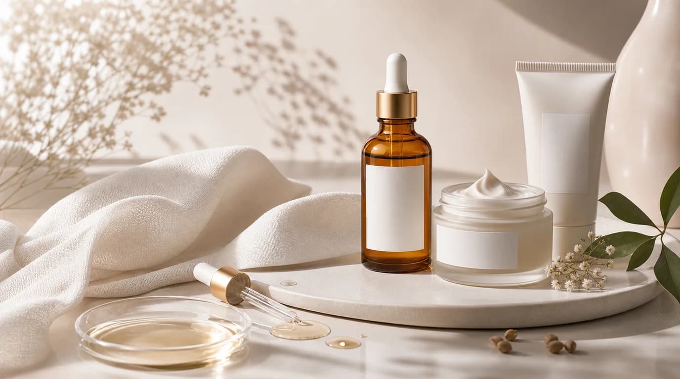
For beauty brands, the goal is not to make every jar look expensive in the same way. A vitamin C serum, cushion compact, cleansing balm, sunscreen, and lip tint each need a different kind of proof.
What matters most in beauty images
Label accuracy comes first. Do not let AI rewrite ingredient names, SPF numbers, shade names, batch marks, or certification icons. If those details are important to a purchase decision, keep them from the original product photo and build the scene around them.
Texture is the second trust signal. A gel cream should not become a heavy butter. A serum should not look like sticky syrup unless that is true. Color cosmetics need even more care because shoppers compare the image to their skin tone, previous purchases, and reviews.
Shot list for cosmetics and skincare
- Front-facing hero image with the label readable at marketplace thumbnail size
- Cap, pump, dropper, wand, or compact open shot to show how the product is used
- Texture smear or dispense shot, especially for creams, serums, balms, sunscreens, and lip products
- Scale image beside a hand, pouch, shelf, or routine lineup
- Ingredient or benefit scene using simple props that do not imply unsupported claims
- Set image for bundles, routines, shade ranges, or travel sizes
How to use GESTEL
Start with the cleanest product photo you have. In GESTEL, keep the product geometry and label as the anchor, then generate backgrounds that fit the category: bathroom counter, studio acrylic, soft morning vanity light, clinical white, or K-beauty editorial pastel. Use prompts that describe lighting and environment, not new text on the package.
For shade products, generate lifestyle scenes separately from shade reference images. The shade reference should stay controlled and neutral. The lifestyle image can carry mood, season, and campaign direction.
A stronger beauty image set
Build the page like a consultation, not a mood board. Use the hero image to identify the product, the texture image to explain the formula, the routine image to show where it fits, and the scale image to prevent surprise. For skincare, a useful set often includes closed pack, open cap or pump, dispense amount, bathroom or vanity context, and bundle lineup. For color cosmetics, add shade grid, arm or lip swatch, applicator close-up, and one real-use look where the shade is not overfiltered.
Common mistakes to avoid
Do not add water droplets to every skincare bottle. They can look fresh, but they also suggest cooling, cleansing, or water resistance depending on the product. Do not surround products with ingredients that are not actually part of the formula. Do not let reflective caps pick up strange shapes that make the packaging look damaged.
Also watch for beauty-specific trust leaks: white packaging that turns gray, caps that no longer align with the bottle, sunscreen shown like a foundation shade, toner pads that look dry, or cream texture that looks separated. These details make shoppers wonder whether the image is hiding the real product.
Final checklist
Before publishing, zoom in on every label, shade mark, certification badge, and opening mechanism. Compare the generated image to the physical product. If the AI scene makes a claim that the product page cannot support, revise the scene. Good beauty photography sells the formula without inventing a new one.