Coupang Product Image Guide for Fast Mobile Buyers
Coupang shoppers decide quickly
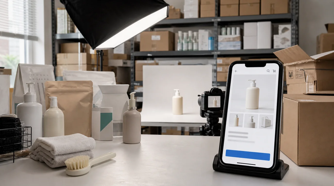
Coupang product photography has a different job from a brand lookbook. The buyer is often moving fast, comparing similar listings, and checking whether the product solves an immediate need. Your image set should reduce comparison work.
The strongest Coupang images make four things obvious: what is included, how large it is, which option is being sold, and whether the listing matches the title.
Build the set around comparison
- Main image: uncluttered product or package view with the sold quantity visible when practical.
- Component image: everything in the box or bundle laid out clearly.
- Size image: real-world scale with measurements or a familiar object.
- Use image: one everyday situation, not a cinematic scene.
- Difference image: what changes between options.
- Detail image: material, connector, texture, seal, ingredients, or expiration area if relevant.
If the product is sold in packs, do not hide the pack count behind decorative styling. If the buyer has to read the title again to know whether it is one item or six, the image is not doing enough work.
GESTEL workflow
Use GESTEL to create a clean main image first, then keep the same lighting logic across the rest of the set. Coupang pages can show images in a very practical context, so realism beats drama.
For household goods, generate a neutral Korean apartment or kitchen context. For electronics, use desk and cable scenes. For beauty and supplements, keep packaging readable and avoid AI-generated ingredient claims. When in doubt, preserve the original label photo and only clean the background.
Coupang-specific sequencing
Treat the gallery like a compressed FAQ. Image one identifies the offer. Image two confirms the pack count or included parts. Image three handles scale. Image four shows ordinary use. Image five deals with the return-risk detail: fabric thickness, connector type, filter size, refill shape, seal, or expiration location.
For Rocket-style expectation, avoid visuals that make delivery speed or service level look guaranteed unless the listing is actually eligible and current platform rules allow that presentation. Product images should clarify the item, not borrow trust from claims that may change.
Pitfalls that hurt conversion
The most common failure is visual mismatch. A generated image may look better than the source but imply a larger size, different texture, or premium finish. Coupang reviews often react strongly to expectation gaps, so the image should be persuasive without exaggerating.
Another issue is option confusion. If one listing has multiple colors or quantities, the first image after the main image should clarify the selected option family. Do not make customers infer it from small swatches alone.
QA before publishing
Read the title, option name, and first two images together. A shopper should not have to solve whether this is the single item, refill, starter kit, renewed version, or bundle. Then zoom into the generated images and check shadows around package edges; unrealistic contact shadows often make multipacks look digitally assembled.
Internal production tip
Create one reusable Coupang preset in GESTEL for crop ratio, shadow softness, margin, and background brightness. Then create product-specific scenes only where they add information. This keeps the catalog coherent without making every listing look copied from the same template.