Create a Product Photo Style Guide Your Team Can Actually Use
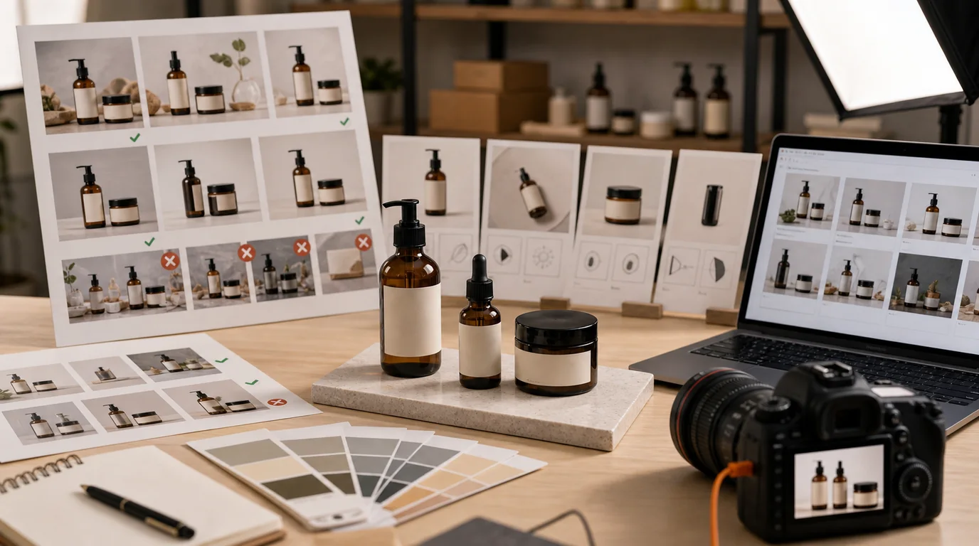
A product photo style guide should reduce decisions, not add another brand document nobody opens. It tells a seller, designer, marketer, or AI operator what a correct image looks like and when an image should be rejected.
Keep it short, visual, and operational.
Define the image roles
Start with the image types your catalog actually uses:
- Listing thumbnail.
- Product page hero.
- Secondary angle.
- Detail close-up.
- Scale image.
- Packaging or contents.
- Lifestyle image.
- Ad creative.
Each role needs separate rules. A thumbnail may require a plain background and strong silhouette. A lifestyle image may allow context and props. An ad creative may allow more space for copy, while a product page image should avoid text overlays unless required.
Lock the repeatable choices
For each image role, define:
- Background colors or surfaces.
- Lighting direction and softness.
- Crop distance.
- Product angle.
- Shadow strength.
- Allowed props.
- Disallowed props.
- Logo and label rules.
- Export ratio.
This gives /create specific boundaries and makes review faster. For example: product page hero uses warm white background, soft shadow falling right, product fills 75 percent of frame, no lifestyle props, label front-facing.
Write rules as production defaults
Avoid vague rules such as clean, premium, natural, or modern unless they are translated into visible decisions. A usable guide says:
- Use warm white background for hero images, not pure gray.
- Shadow falls to the lower right and stays soft.
- Product fills roughly three quarters of the frame for PDP hero.
- No flowers, food, stationery, or fabric props unless listed for that product line.
- Labels face camera unless the role is lifestyle or texture.
The point is not to remove judgment. It is to make the normal decision obvious so reviewers only discuss exceptions.
Include do and do-not examples
A style guide without rejection examples is weak. Add examples like:
- Do: one ceramic mug on pale stone surface, handle visible, soft left light.
- Do not: mug surrounded by pastries, flowers, and unreadable text cards.
- Do: skincare bottle with label straight, subtle shadow, cap aligned.
- Do not: bottle angled so the product name is hidden.
The do-not examples matter because AI prompts can sound reasonable while producing images that break the brand.
Make naming part of the guide
File naming is style governance. Use a pattern:
- sku-role-background-version-status.
Examples:
- sku123-hero-warmwhite-v01-review
- sku123-scale-hand-v02-approved
- sku123-ad-springgreen-v03-archive
This prevents approved assets from being overwritten and makes it easier to compare variants later.
Add an approval ladder
Do not approve style before accuracy. Use this order:
- Product shape.
- Logo and label.
- Color and material.
- Image role fit.
- Brand style.
- Export quality.
If the product is distorted, it fails even if it matches the mood. If the label is wrong, it fails even if the background is perfect.
Keep it alive
The guide should change when the catalog changes. Add a short review cadence:
- Update after a major product launch.
- Update after a visual rebrand.
- Update when marketplace requirements change.
- Update when repeated review comments show a rule is unclear.
For implementation, store the style guide beside your production workflow and link it when creating images in /create. It also pairs naturally with /blog/ai-image-workflow-ecommerce, because the guide becomes the standard used at every review checkpoint.