Texture Close-Up Product Photos Without Making the Product Look Fake
A texture close-up is useful only when it reduces uncertainty. It should help a shopper understand softness, grain, finish, thickness, surface quality, or application. If it merely adds a dramatic macro shot, it can make the product look less trustworthy.
The key is to treat texture images as evidence, not decoration.
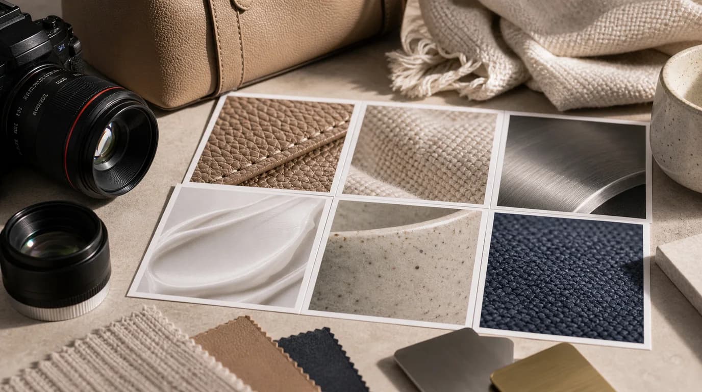
Choose the texture question
Start by naming the exact question the image should answer:
- Is the fabric tightly woven or loose?
- Is the leather smooth, pebbled, or glossy?
- Is the metal brushed, polished, or matte?
- Is the cream lightweight, dense, gel-like, or oily?
- Is the ceramic surface handmade, speckled, or perfectly smooth?
- Is the paper thick, fibrous, coated, or recycled?
One close-up should answer one question. If you try to show texture, color, logo, scale, and lifestyle in the same close-up, none of them will be clear.
Use the source photo as the boundary
AI can exaggerate material. That is especially risky for products where texture affects trust: apparel, bags, cosmetics, furniture, jewelry, food, stationery, and handmade goods.
When creating in /create, keep the source product visible and specify what must not change:
- Same fabric color and weave direction.
- Same leather grain size as the source.
- No added stitching, embossing, scratches, or pattern.
- Preserve label placement and edge shape.
- Keep surface finish matte, not glossy.
If your original close-up is good but low resolution, use /edit/upscale instead of regenerating the material. If the background is the issue, clean it with /edit/remove-bg and keep the texture intact.
Pick the crop distance
There are three useful crop levels.
Near crop shows material while still keeping product context. Use it when the buyer must know where the texture appears.
Macro crop shows surface detail with little context. Use it for fabric, leather, paper, cream, powder, grain, or finish.
Edge crop shows thickness, seams, rims, lids, folds, or layered construction. Use it when build quality matters.
Do not use macro crops for every product. A stainless tumbler may need an edge and finish shot more than an abstract metal texture.
Keep texture tied to a claim
Only create a texture close-up when the page can explain why it matters. The image and copy should support the same claim:
- Soft cotton: show weave and thickness, not just a cozy scene.
- Non-slip grip: show the surface pattern where the hand touches.
- Matte finish: show reflection control under soft light.
- Cream texture: show the amount and spread behavior, not a random smear.
- Handmade ceramic: show the glaze variation without making defects look worse.
If the product copy does not mention the material, finish, or feel, the close-up may be unnecessary. Use that slot for scale, contents, or use context instead.
Review against the real product
Texture images must be reviewed next to the original product photo, not in isolation.
Check:
- Color has not shifted warmer, cooler, darker, or more saturated.
- Pattern frequency is believable.
- Grain or weave is not too perfect.
- No new seams, fibers, pores, bubbles, or scratches appeared.
- Product edges still match the actual shape.
- The image does not imply a different material tier.
For example, a cotton pouch should not become linen. A vegan leather case should not become full-grain leather. A light lotion should not become a heavy balm.
Where to place it on the page
Texture close-ups usually belong after the hero and basic angle images, not before them. First confirm the product, then explain the material.
A practical order is:
- Hero.
- Alternate angle.
- Texture close-up.
- In-use or scale image.
- Care, packaging, or variant image.
For products where material is the main reason to buy, move the texture image earlier. For products where texture is secondary, keep it lower.
Prompt examples
Useful prompts are plain and controlled:
- Close-up of the same beige woven pouch fabric, natural side light, weave visible, no new seams or pattern.
- Macro view of the same matte ceramic glaze with subtle speckles, edge of cup visible, no cracks.
- Close-up of the same gel cream texture on a clean spatula, translucent finish, no extra packaging text.
Avoid prompts like luxury texture, premium surface, or ultra-realistic macro without constraints. Those instructions invite the model to improve the product instead of representing it.