Brand Mood Background Templates: A System for Consistent Product Image Trust
A product background is not just decoration. It teaches shoppers what kind of brand they are looking at before they read a line of copy.
When backgrounds change randomly from page to page, the store can feel stitched together. When they are too rigid, every image feels templated. The useful middle ground is a small background system: enough consistency to build recognition, enough variation to keep campaigns alive.
Define mood before visuals
Do not start with colors, props, or AI prompts. Start with the buying emotion your brand needs to support.
Common mood directions include:
- Clinical clarity: precise, bright, minimal, useful for skincare, supplements, tools, and technical products.
- Warm everyday: natural light, familiar surfaces, useful for home goods, food, stationery, and family products.
- Editorial premium: controlled shadows, fewer props, stronger composition, useful for fashion, fragrance, jewelry, and design objects.
- Active proof: motion, outdoor context, hands, wear, useful for sports, travel, pet, and durable goods.
- Quiet craft: texture, material, close range, useful for handmade, ceramics, leather, and small-batch products.
The mistake is choosing a mood because it looks good in isolation. Choose the mood that makes the product easier to believe.
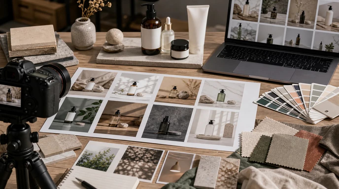
Build a template set, not one template
A single background template becomes repetitive quickly. A set of five to seven reusable formats is more flexible.
Consider building these:
- Clean commerce background for product grids.
- Soft brand background for product detail heroes.
- Scale reference scene with a hand, body, table, or room.
- Detail background for texture and material close-ups.
- Seasonal or campaign background with controlled variation.
- Bundle or kit layout background.
- Editorial story background for blog and collection pages.
Each template should have a job. If two templates answer the same question, combine them.
Decide what must stay consistent
Consistency does not mean every image must look identical. It means the shopper should feel that the images came from the same brand and the same truth standard.
Lock these elements:
- Product color accuracy.
- Shadow direction and intensity range.
- Cropping rules for primary product images.
- Prop density.
- Background brightness range.
- How much texture is allowed.
- Whether hands or people appear.
Allow variation in:
- Seasonal accents.
- Secondary props.
- Surface material.
- Camera distance.
- Campaign color accents.
- Blog and guide imagery.
This gives the creative team room while protecting trust.
Use backgrounds to clarify positioning
Backgrounds can quietly reinforce price and category position.
A budget-friendly product does not need to look cheap. It needs to look accessible, direct, and easy to understand. A premium product does not need heavy drama. It needs restraint, material confidence, and visual accuracy.
Ask:
- Does this background make the product look more expensive than it is?
- Does it hide important product information?
- Does it make the brand easier to recognize?
- Could this image sit next to other products in the same collection without feeling accidental?
If the answer is no, the background is working against strategy.
SEO value comes from usefulness, not decoration
Background systems help SEO indirectly. They make pages more coherent, improve user confidence, support richer collection and blog content, and reduce the need to remake every image from scratch.
They do not work because a background contains a keyword. They work because better images help visitors understand the page and continue exploring.
Use background templates for:
- Collection pages that need fast comparison.
- Buying guides that explain use cases.
- Blog images that support search intent.
- Seasonal pages that need freshness without losing brand consistency.
- Product pages that need a predictable image order.
If you are building templates for blog growth, connect the visual system to the topic strategy instead of treating images as an afterthought.
AI generation needs brand constraints
AI can create many background variations quickly, which is useful and risky. Without constraints, it will make images that look polished but unrelated.
Write brand constraints before generating:
- Allowed lighting style.
- Allowed surfaces and materials.
- Prop categories to include or avoid.
- Crop ratios for each page type.
- Product accuracy rules.
- Words that describe the brand and words that do not.
Then review outputs against the system, not just against taste.
For trust-sensitive categories, also define what AI must not alter: product shape, ingredients, labels, regulatory markings, fit, color, and included accessories.
Make the template usable inside GESTEL
A background system only works if the person producing the next image can apply it without guessing. Create a short template card for each approved mood.
Include:
- Template name: clinical-white-grid, warm-kitchen-scale, editorial-stone-detail, or another stable internal name.
- Product categories allowed for the template.
- Prompt notes for lighting, surface, camera distance, and prop limits.
- Negative rules such as no extra accessories, no generated labels, no fake certification marks, no invented ingredients.
- Output roles such as hero, detail, lifestyle, blog header, or campaign banner.
- Required review before publishing: product accuracy, crop, alt text, file name, format, and page speed.
For filenames, keep the template name out of the public file name unless it helps users. A public name like ceramic-mug-blue-lifestyle-breakfast-table is clearer than warm-kitchen-template-v3-final. Internally, the CMS or asset notes can still record the template used.
This is where brand consistency and SEO operations meet. The same GESTEL background can support a collection card, a buying guide image, and a seasonal landing page, but each output still needs its own crop, alt text, and compression review.
A simple background audit
Review a collection of product images and ask:
- Can a shopper recognize the brand if the logo is removed?
- Do similar products have similar image treatment?
- Are premium cues earned by product detail, or only by mood?
- Are props helping explanation or creating confusion?
- Do the backgrounds make the page slower or harder to scan?
- Are AI-generated images reviewed for product accuracy?
If you find inconsistency, do not rebuild everything. Start with the highest-traffic product pages and the collection pages that receive search traffic.
The template brief
A useful background template brief includes:
- Page role: product grid, detail page, blog, campaign, or ad.
- Mood: the trust emotion the image should create.
- Product rules: what cannot change.
- Background rules: allowed surfaces, colors, and lighting.
- Composition rules: crop, scale, shadow, and empty space.
- Review rules: what makes an image fail.
This brief is more valuable than a folder of pretty examples. It lets designers, photographers, and AI tools produce work that belongs to the same brand system.
Keep the system small
The best background template system is easy to use. If it requires a long meeting for every product, it will be ignored.
Start with a small set. Use it on real pages. Watch where shoppers hesitate. Then adjust.
Good brand mood templates do not make every image look the same. They make every image feel accountable to the same promise.