Optimize Product Detail Image Order for Buyer Decisions
The order of product detail images changes how shoppers understand the product. A strong image buried at the bottom may not help. A detail close-up shown too early can confuse shoppers before they know what the product is.
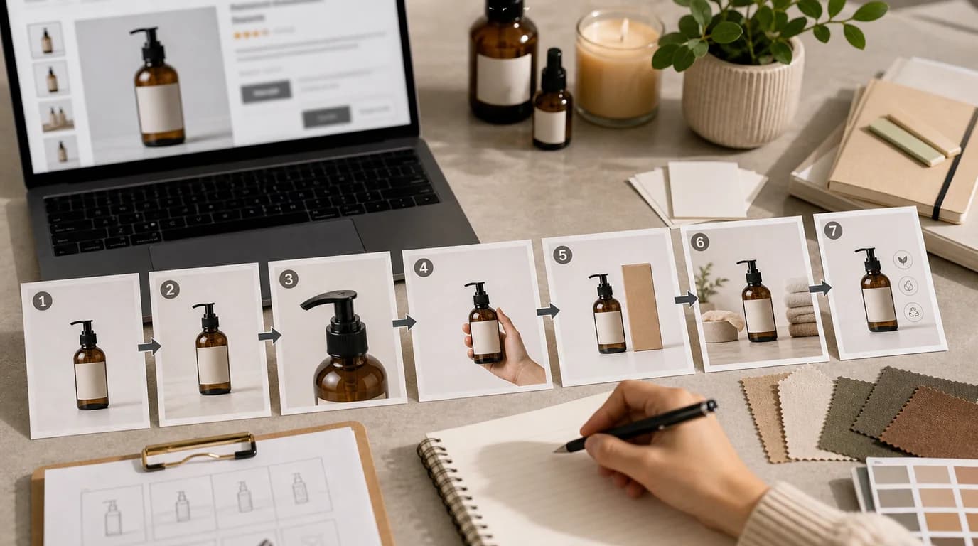
Image order should follow buyer decisions, not an internal asset folder.
Map the decision path
Most shoppers move through a sequence:
- Identify the product.
- Decide whether it is relevant.
- Check important details.
- Understand size or fit.
- Confirm what is included.
- Resolve objections.
- Feel ready to buy.
Arrange images to support that path. If your page starts with packaging before the product is clear, you are asking the buyer to care too early.
Use a default order, then adjust
A practical default order:
- Hero image.
- Alternate angle.
- In-use image.
- Scale or fit image.
- Detail or texture close-up.
- Variant or comparison image.
- Packaging and contents.
- Care, compatibility, or reassurance image.
This is a starting point, not a law. If material is the main purchase driver, move texture earlier. If size is the main objection, move scale earlier. If the product is a gift set, packaging may deserve a higher position.
Diagnose weak order
Watch for symptoms:
- Users ask questions already answered lower on the page.
- The first image gets clicks but the page does not explain the product quickly.
- Mobile shoppers see three similar images before any new information.
- Variant images appear before the base product is understood.
- Packaging appears before contents clarity.
These are ordering issues, not always image quality issues.
Create missing bridge images
Sometimes the order feels wrong because a bridge image is missing. For example, the page jumps from clean hero to extreme close-up with no use context. Create a bridge image in /create:
- Product on the surface where it is normally used.
- Product held naturally for scale.
- Product beside the package.
- Product opened, unfolded, applied, or assembled.
Use /edit/remove-bg when you need to build from an accurate source product, and /edit/upscale after the bridge image is approved.
Remove images that repeat the same answer
Optimization is not only moving images forward. Sometimes the best change is deleting one. Two images are redundant when they answer the same buyer question with the same level of detail.
Keep both only if the second image adds a different decision point:
- A second angle shows depth that the first angle hides.
- A second lifestyle image shows a different use case, not just a different room.
- A second detail image explains another material or mechanism.
- A second package image separates exterior from contents.
If the next image does not add information, it slows the buyer down. This matters most on mobile, where every swipe has a cost.
Review on mobile first
Mobile shoppers see images one at a time. Repetition hurts more on mobile than desktop. Swipe through the gallery and ask:
- Does each next image add new information?
- Is the product still recognizable?
- Are important details visible before the description text?
- Does the sequence answer the biggest objection soon enough?
- Are similar images grouped or redundant?
Remove or move images that do not advance the decision.
Test order carefully
If you test image order, keep the image set constant and change only placement. Otherwise you cannot tell whether the result came from the image or the order.
Good tests:
- Move scale image from position five to position three.
- Move packaging from position two to position six.
- Place lifestyle before detail close-up.
Bad tests:
- Replace the hero, change the order, and rewrite the offer at the same time.
Use /blog/ab-testing-product-photos-ai for a stricter testing process. For the production baseline, connect your order decisions to the shot list and workflow in /blog/ai-image-workflow-ecommerce.